Presenting financials to a board may, on the face of it, seem like a fairly straightforward task. Actually, it’s not. That’s because you’re not just presenting financials, you’re telling a story. And good storytelling is hard to do.
I’ve learned that getting it right requires a combination of a strong narrative, unambiguous messaging, and clear visuals that effectively communicate the data. Knowing how to frame the story begins by understanding your audience.
Because not all boards, and not all board members, are the same, doing the groundwork to understand the board, its members, and their priorities, is a critical first step.
In general, determining the kind of board depends on whether its members see their role as partners in the operational running of the business or as being more focused on broad oversight. This is often influenced by what type of investors are on the board. When a board is composed of private equity investors, it’s likely that they will be more active and engaged in company decision making.
Private equity investors tend to have smaller portfolio companies and take an active role in operational matters and decision-making to support the results they are seeking from each of their portfolio companies. These members typically want to see more detail in order to gain a deeper understanding of the financial data, options, and context for decision-making.
In contrast, VC investors tend to make more investments, spreading their bets across a broader portfolio of companies. As such, as board members, they’re less focused on tactical decision-making and on the operational details impacting a company and instead are more interested in key valuation metrics and trends.
After establishing whether a board wants details for decision-making or more summary information to support oversight responsibility, examine the individual members and their preferences for information.
I suggest arranging a 30-minute meeting with each member right from the start to set expectations and determine the priorities of each. What metrics are they looking for? How do they define company success? Boards add and replace members at various points, so this interview should be conducted each time a new member joins. How will the new member impact the dynamic of the entire board?
Understanding board members’ goals allows the executive team to be proactive, not reactive, in deciding which metrics to include and how much depth to display.
Create a document to serve as a minimum viable product (MVP) — to borrow a term — to circulate before the first presentation. Ask for feedback on the MVP from each member and incorporate their thoughts into the final presentation. This template then becomes the working model going forward.
Think visually.
Having a solid mastery of the numbers underlying a report is essential, but that doesn’t mean that a board needs, or wants, all the details. Instead, convey a sense of confidence in the numbers and faith in their accuracy. Present a narrative that will grab their attention, without overwhelming with detail. A few visual presentation strategies include:
1. Avoid long lists of bullet points: Filling every slide with bullets was my first instinct when I started preparing board decks, but I was quickly disabused of the practice. I now follow a general rule that a board slide shouldn’t contain any more than four bullet points. This can be challenging, but the audience is really only looking for key information. Most members spend just a few seconds looking at a slide, so a presentation has to make the most of their time.
2. Presenting information visually is a much more concise way to convey it: Most of us finance types don’t have the visual or graphic design skills first cataloged by Edward Tufte in his seminal work “The Visual Display of Quantitative Information.”
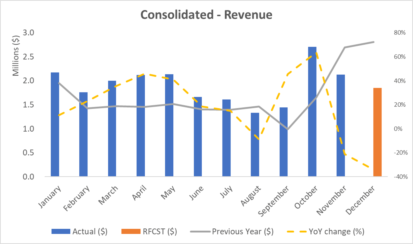
We’ve been steeped in spreadsheets, pivot tables, and simple graphics, which are not what a board wants to see. I am always considering new ways of visualizing data and am on the lookout for great graphs that others have created.
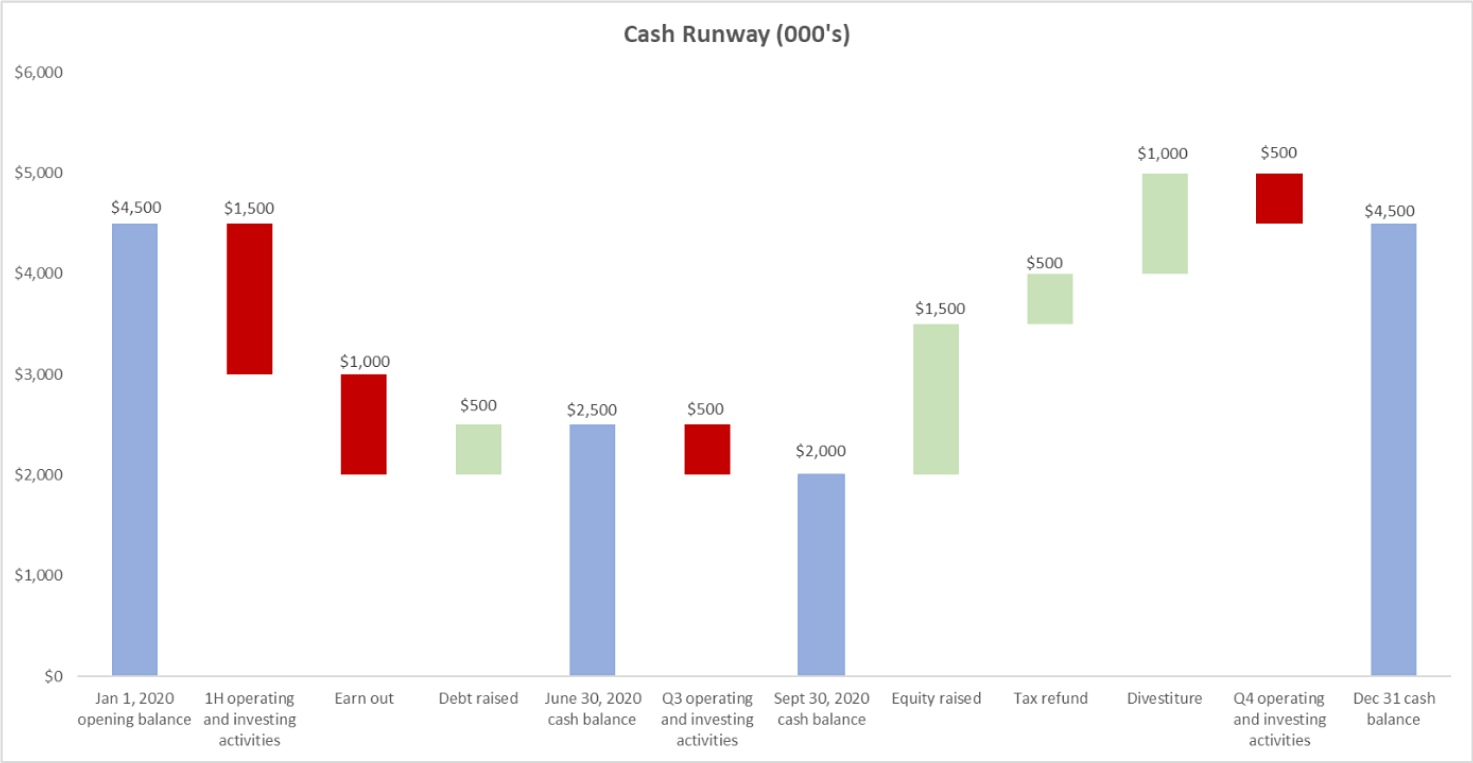
The ultimate goal is to paint a picture with the numbers. For example, one metric everyone likes to see is cash activity — displaying the dynamic nature of this metric makes it easier for board members to instantly understand the trends.

3. Remember that some board members may not have a thorough understanding of the industry: Take a step back and think about how to best convey the important points. The words and images should tell a story about what the numbers mean. So, for example, don’t just show the LTV:CAC ratio. Interpret the number and share guidance around it. Where is it going? What action is needed to achieve the company’s goals?
Depending on the makeup of the board, this may require including detailed financials, but make sure they’re in an appendix at the end of the presentation. A screenshot of the cash balance sheet and income statement can always be referenced if necessary.
Determining benchmarks for success.
The chosen metrics will require agreed-upon benchmarks to put them into context. These benchmarks are typically determined by management since they have the best knowledge of the company. However, some board members may have a depth of experience in the industry sector to contribute information about benchmarks, and this is something that should be uncovered in the initial due diligence with them.
Benchmarks can also be drawn from research into public information, such as competitors’ SEC filings. Investment bankers and equity research analysts are good resources. I suggest taking the time to cultivate relationships with them to help stay on top of industry trends.
For growing companies in relatively new industries, it’s probably most effective to look at the traditional indicators of growth, such as lifetime value, CAC, and customer payback period, as well as traditional financial metrics, like EBITDA and revenue per employee. It’s easy to compare these metrics against other companies under a similar umbrella, even if they’re not direct competitors.
From the board’s point of view, it comes down to being able to show how well a business is deploying capital and labor. Newer sectors can be more difficult to benchmark because there isn’t enough available data. But in those instances, the metrics that are traditionally observed by startups should be relevant. The indicators of success for a technology company don’t vary too much, no matter what industry their product targets.
The flow of information to the board.
Adapt content to fit the general cadence of the board meetings. For example, on a quarterly basis, prepare a more comprehensive and broad report to reach the whole audience, encompassing a three-month summary of activity and including all relevant metrics.
For a monthly report, prepare a more simplified version, with a max of five or six pages, that can be easily tailored to each board member, and perhaps includes custom metrics that reflect each member’s specific interest. When I say customized, I am not suggesting presenting different metrics altogether.
Instead, consider providing variations of the same dataset. Investors who are more interested in tracking the short-term progress of a company might appreciate a weekly report showing specific KPIs.
Looking to the future.
Technological advances have given us more access to data than we’ve ever had before, and I expect that to continue. My view is that, over time, even though research and data crunching will be automated, we’ll need the critical-thinking skills of finance experts to pull it all together.
Data and data analytics will play increasingly powerful roles. I view this wealth of information as an opportunity to create more customized data visualizations for boards in order to foster better business decisions and more successful companies.
This is something that every board, irrespective of its composition, is ultimately focused on.
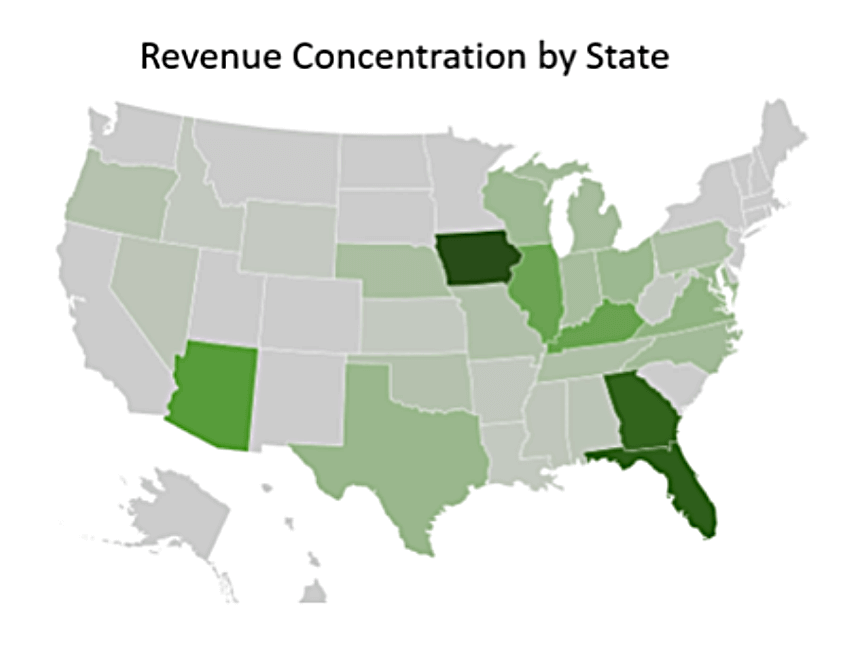
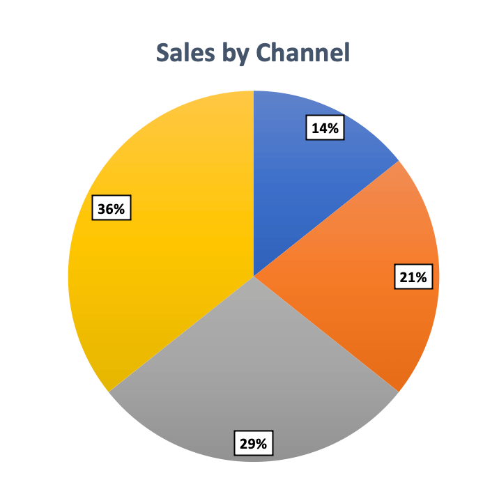
I’ve compiled a small library of graphic displays that I’ve found useful. Below are some examples.


To learn more about Airbase, contact us for a product demo.
 Jira Integration – Streamline Your Workflows
  Ironclad Integration – Simplify Legal Operations
  Asana
Asana 


